Introduction
Page Structure
Each page is made up of sections, rows, columns, and elements. They need to be created in that order, and nest inside their respective elements (sections can house multiple rows, rows can house multiple columns and columns can house multiple elements).
When selecting an item on a funnel page, the surrounding box will change color to indicate what has been select. The surrounding box for Sections have a green border, Rows have blue border, Columns have a purple border and Elements have an orange border.

Add New Items
When you create a new page, follow the prompts to add a section, row (with columns) and a new elements. Drag-and-drop the required items from the menu that appears on the left-hand side of the screen.
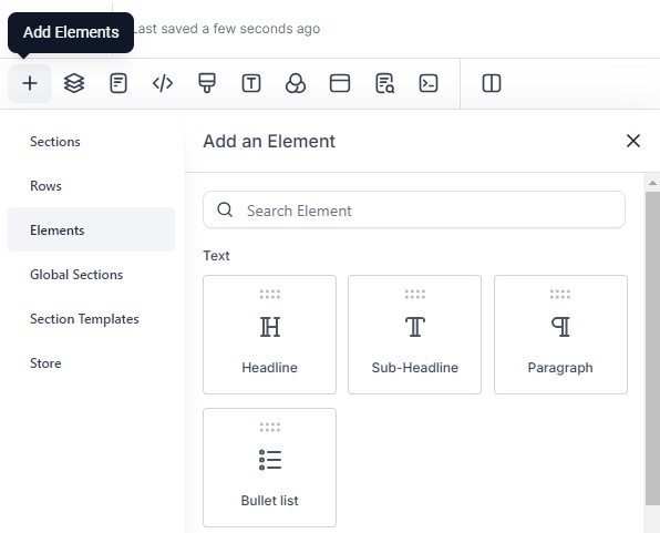
To the adding additional items, select a matching existing item (section, row, column or element) and click on the + icon at the bottom of the surrounding box. You can also select the Add Elements icon in the top menu bar the item. Select Elements from the menu and drag-and-drop the required items onto the page.
Add, Move, Clone or Delete
Selecting a section, row, column or element will bring up a surrounding box with additional options. These options include move up or move down in the top left corner and drag, clone, and delete in the top right corner. Sections also have a save option (either as a global section for that funnel or as a template to add to other funnels).
You can also manage layers and elements by clicking on the Layers icon in the top menu bar,

Menu Bar
Manage Layers
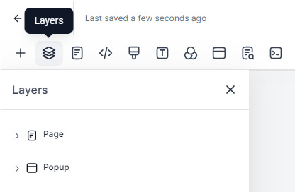
To manage layer such as sections, rows, columns or element, click the Layers icon in the top menu bar. Here you have the options to can reorder, hide or show, edit, clone and delete. This can be especially useful when a section, row or column has no padding and you cannot select it easily.
Navigate to Other Pages
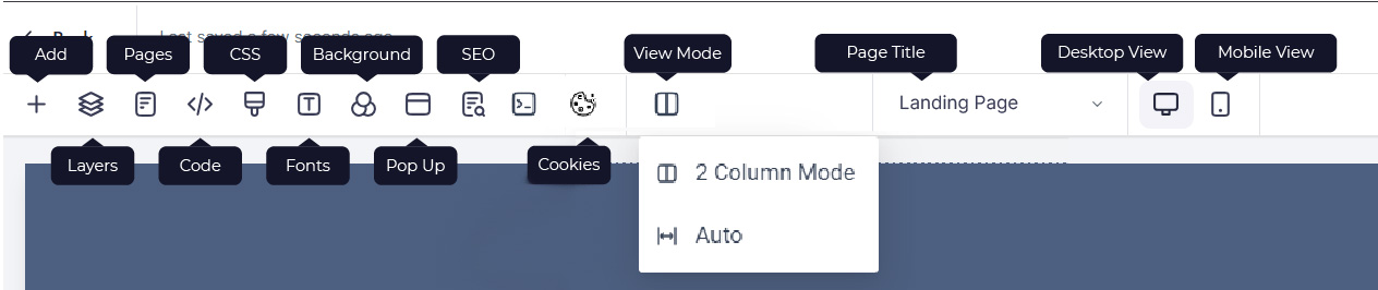
To navigate between different pages in the funnel, you can either click the Pages icon in the top menu bar or click on the page title. Press Save to save any changes first and then select the page you want to change to in the left hand panel.
Tracking Code
To add tracking code for the page (rather than adding site wide in the funnel settings), click on the Tracking Code icon in the top menu bar.
Custom Css
To add custom CSS to the funnel, click on the Custom CSS icon in the top menu bar.
Typography/Fonts
To change default heading and paragraph fonts, click on the Typography icon in the top menu bar. Click on the font you want to change, and either type in the name of the font you want (if you know it) or select one from the dropdown list.
The fonts in that list are Google Fonts, and there are nearly 2,000 font families to choose from. Click here to browse/preview the available fonts. To use a font that is not a Google Font, you need to add it yourself in the Custom CSS box.
Background
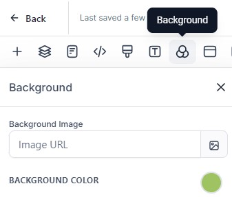
To edit the background color or add/edit the background image, click on the Background icon in the top menu bar.
Popup
Click here for more information about creating and editing a popup.
Seo Meta Data
You can edit SEO meta data (such as page title, description, keywords, author and social image) by clicking on the SEO Meta Data icon in the top menu bar. Adding the information in the right hand panel, click Update Meta Data in the bottom right corner.
For Facebook, the social image dimensions should be 1200 x 630px.
Cookie Consent
Click here for more information about adding a cookie consent banner to your funnel.
View Mode
You can choose between 2 Column Mode (which pushes the funnel editing space to the left to make space for the properties panel) or Auto (where the properties panel sits on top of the funnel editing space).
Visibility
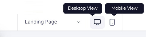
In the center of the menu bar, you can toggle between desktop view and mobile view.
Click here for more information on optimizing for mobile.
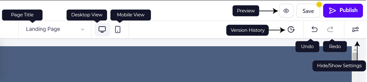
Preview Page
You can preview the page by clicking on the Preview button In the top right corner. This will also save the page.
Save/Publish Page
You can save your changes by clicking on the Save button In the top right corner. Be sure to regularly save any changes you've made. Once complete, press Publish to make those changes live.
Versions
You can restore previous versions of funnels by clicking on the Versions buttons. You can preview previous versions and press Restore.
Undo/Redo
You can undo and redo actions using the icons on right of the menu bar. This can be particularly useful if you delete a section or element accidentally.
Element Formatting
Settings and Formatting
Clicking on a section, row, column, or element will bring up a settings menu on the right-hand side. Depending on what has been selected there will be a General tab and an Advanced tab, each giving different options.
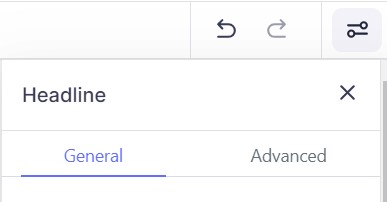
The settings include options such as background images, background colors, padding, margin, fonts, font size and font colors, shadows, borders, text transforms. You can set a redirect action on a form, survey, button, calendar, etc.
Section Width
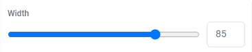
You can change width of a section under the General tab. You can also change the alignment. This can be useful when trying to make text look balanced. Note that this only affects desktop; section width is always 100% on mobile.
Padding and Margins
You can change padding and margins for sections and elements in the left hand panel under the General tab. Click on the value that you want to change and then either use the slider, type in a value, or select one of the pre-set options.
You can also set different values for desktop and mobile. By default, all changes made initially to the desktop design will be applied to the mobile version. To make specific changes to the mobile version, click on the desktop/mobile icon next to the Margin & Padding title. You can also swap to Mobile Mode in the menu bar.
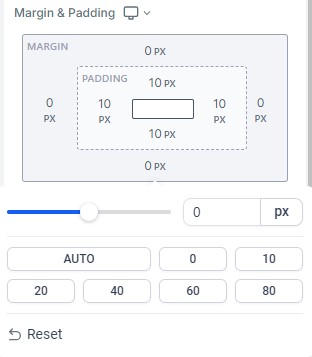
Note that left padding and right padding for sections, rows and columns affects desktop only. Left padding and right padding for elements affects desktop and mobile.
Text and Box Shadows
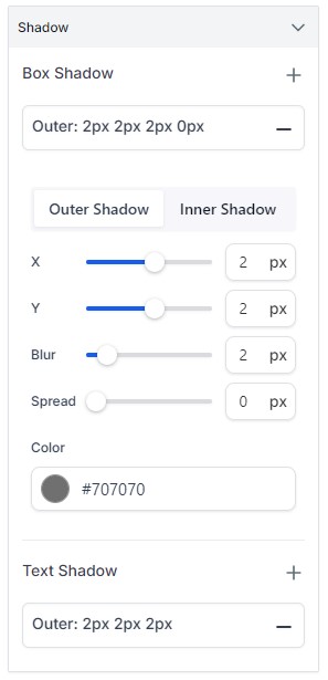
To add text or box shadows to an element, click on the element and go to the Advanced tab. Under the Shadow section, click on the + icon to next to Box Shadow or Text Shadow to apply the effect. Clicking on the shadow options will open an additional menu where you can change the shadow values, blur, spread and color.
Element Name/Title
It can be helpful to name certain items on your page, especially sections. Click on the item and type a new name in the Element Name/Title box at the top on the General tab in the left-hand panel.
Add Elements
You can add a variety of elements to a funnel page including headings, paragraphs, bullet lists, images, forms, payment forms, calendars, surveys, and buttons.
Click here for information about funnel elements.
Page Background
To change the entire funnel background, click on the Background icon in the top menu bar. You can click the picture icon to add a background image (and then choose the Image Option and the Image Opacity). You can click the filled circle to add a Background Color. If you change the opacity of the background image, the background color will show through.
Mobile Optimization
Optimize for Mobile
When building funnels, we use a desktop, so it can be easy to make the mobile version an afterthought. However, as the majority of users will probably using a phone to access your page, it is extremely important that you consider how your funnel looks and functions on mobile devices.
When designing a funnel, you can toggle between Desktop Mode and Mobile Mode by selecting the icons in the menu bar.
Once the page has been completed, we also recommend viewing the funnel page on a real mobile. Note that the page will look vary slightly in appearance on different mobile screens.
Text Size, Alignment and Line Height
You can define different font sizes, font weight, text alignment and line height for desktop and mobile. By default, the mobile version will take on the same values as the desktop version. To change these, either select Mobile Mode from the top menu bar or select mobile from the element properties.
Button and Image Alignment
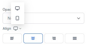
For button and images, you can set different alignments for desktop and mobile. By default, the mobile version will take on the same values as the desktop version. To change these, either select Mobile Mode from the top menu bar or select mobile from the element properties.
Padding and Margins
For all elements, rows, columns and sections, you can set different margins and padding. For example, you may want more padding on the top and bottom of sections on desktop to give the layout breathing space. You may also want the header section to take up more room on desktop than you do on mobile. You may also want to add margins at the bottom of columns on mobile to create space between the sections.
By default, the mobile version will take on the same values as the desktop version. To change these, either select Mobile Mode from the top menu bar or select mobile from the element properties.
Visibility
There will also be times when you want an element to appear on either desktop or mobile, but not both. For example, you may want to add a extra image to the desktop version to fill up the space next to text.
We recommend building the desktop version first and then, in mobile view, determine which sections or elements don't show up how you want them to. Once you've determined what you need to change, you can duplicate them, change one version to desktop-only and the other to mobile-only. You'll then be able to edit the mobile-only as needed.
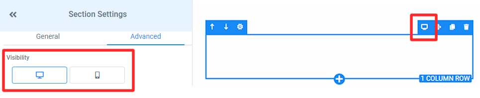
To change whether a section or element is visible or hidden on desktop and/or mobile, select the item and change the Visibility for each device in the Advanced tab in the left panel. When an element is only visible on certain devices, an additional icon will appear in the top right cover of the surrounding box for that item to indicate the visibility settings.
The visibility of a parent item will supersede the visibility for a child item (eg, if a column is set to only be visible on desktop, then all of the elements within that column will also only be visible on desktop).
Funnel Colors
View/Add Colors
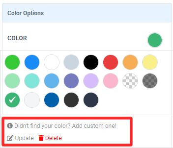
To view the funnels colors, click on any element to bring up Color Options in the General tab and click on the filled circle. To add a new color, click on Add Custom One. Type in the hex code and press Add Color to save.
To update an existing color, first click on the color and then choose Update. Add the new hex code and press Update Color. Updating a custom color will update all the elements on the page that use that color.
To delete an existing color, first click on the color and then choose Delete and click OK to confirm. Deleting a color will make any elements on the page that had that color transparent.
Transparency
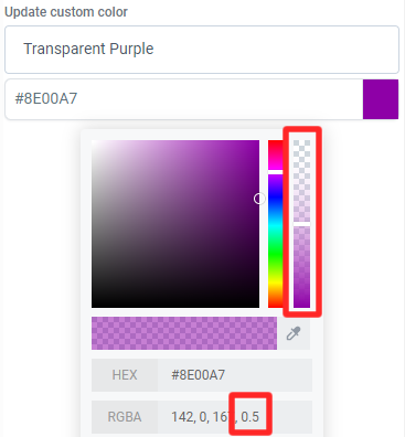
To change the transparency of a custom color, click on the filled square next to the hex code to open additional settings and either use the vertical slider or change the alpha value.
Popup
Create a Popup
To create a popup, click on the Popup Settings icon in the funnel menu bar. When the popup window opens, hover over the plus icon and click on the green + Add Row button. In the right-hand panel, choose the number of columns and then add the required elements.

Edit the Popup Settings
To edit the popup settings, click on the blue Open Popup Settings at the top of the popup window. In the right-hand panel, under the General tab, there are options to change the padding, background color, background image, overlay color and width.
You can also change whether you want to popup to only appear when a button is pressed (None) whether the popup shows on Exit (by default, this is toggled on), or whether it appears after a delay. If Delay is selected, then you will be given additional options to specify the numbers of seconds you want the delay to be.
In the right-hand panel, under the Advanced tab, there are options to change popup border (including style, width and color) and the border radius. There is also the option to add a box shadow.
Global Sections
Global sections are a great way to set up your website efficiently, with sections that will appear on every page. This saves you time, as sections won't need to be copied over from page to page. A header or footer, for example, are common global sections that appear on the top of most websites.
Save a Global Section
- Click Sections > Manage Sections at the top of the page.
- On the right, you see icons to reorder, toggle visibility, copy, save, or delete. Choose Save.
- Under Save As select Global Section and name the section. Click Save.
Access Global Sections
- Click the green plus to add a new section or click Sections > Add Section at the top of the page.
- On the right-hand side, you'll see 3 options under the Section menu. Choose Global Sections.
- Drag and drop into the web page.
- Click Save in the top right corner to save your changes.
Cookies and Funnel Compliance
Cookie Consent
If your funnel collect personal data or has tracking code (such as a Meta pixel or Google Analytics), you may need a cookie notice (depending on where you operate and where your website visitors are from). If either your business or customers are based in the UK or Europe, you will need cookie consent. Click here to read the GDPR regulations. If your business is based in Australia, you may need cookie consent. Click here to read the APP regulations.

Cookie Consent
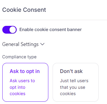
- To add a cookie notice, click on the Cookie Consent icon in the top menu bar.
- Toggle on Enable Cookies in the right hand panel and check the box on the popup window to show that you understand the information.
- Under General Settings, choose the Compliance Type (whether you want users to opt in or whether you just want to inform them that you use cookies).
- Edit the Message Description as required and choose whether you want to provide a link to your privacy policy.
- To change the style of the cookie notice, expand the Styling Options box and edit the fonts and colors.
- Press Save to save changes and then press Publish when complete.